plotdbeta
plotdbeta.RmdThe purpose of the plotdbeta function is to visualize
the probability density of a beta distribution. By default, the function
also includes a line indicating the distribution’s expected value and
shades a 95% highest density or credible interval. We’ll start with a
default plot and then explore modifications.
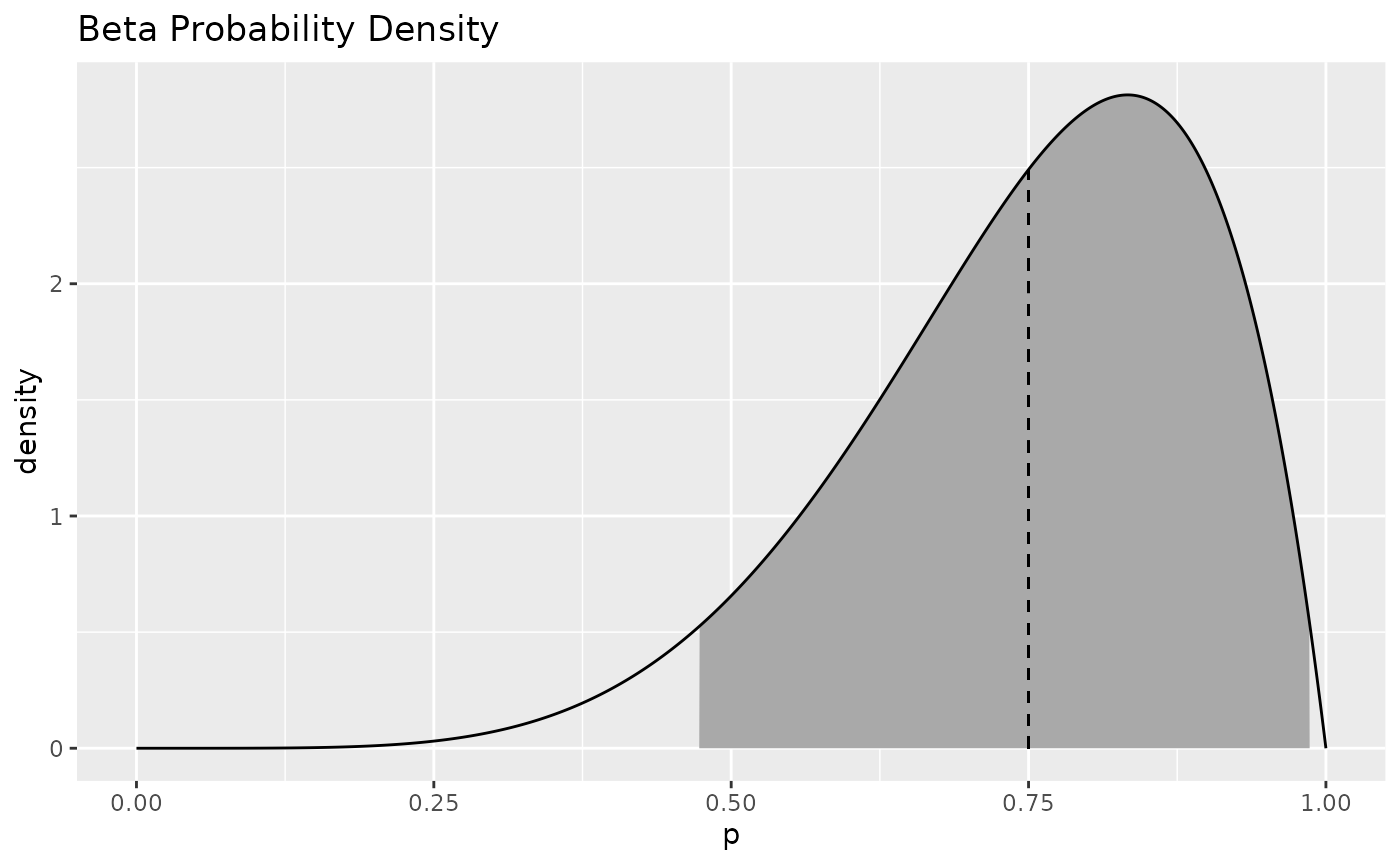
plotdbeta(6, 2)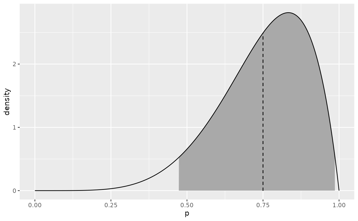 The function returns a ggplot2 object, which can be added to in any of
the standard ways, like adding a title. Note that loading BetaBayes does
not automatically load ggplot2, which we need to do in order to use
ggplot2 functions without explicitly scoping them (like calling
ggplot2::ggtitle(“My Title”)).
The function returns a ggplot2 object, which can be added to in any of
the standard ways, like adding a title. Note that loading BetaBayes does
not automatically load ggplot2, which we need to do in order to use
ggplot2 functions without explicitly scoping them (like calling
ggplot2::ggtitle(“My Title”)).
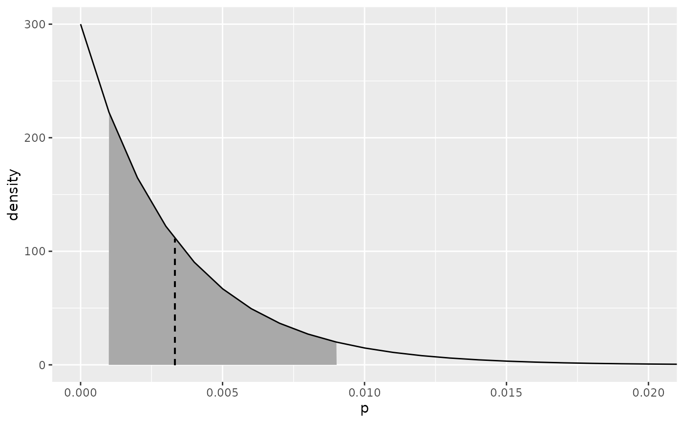
Some beta distributions have most of their mass bunched up in one area, like this.
plotdbeta(1, 300)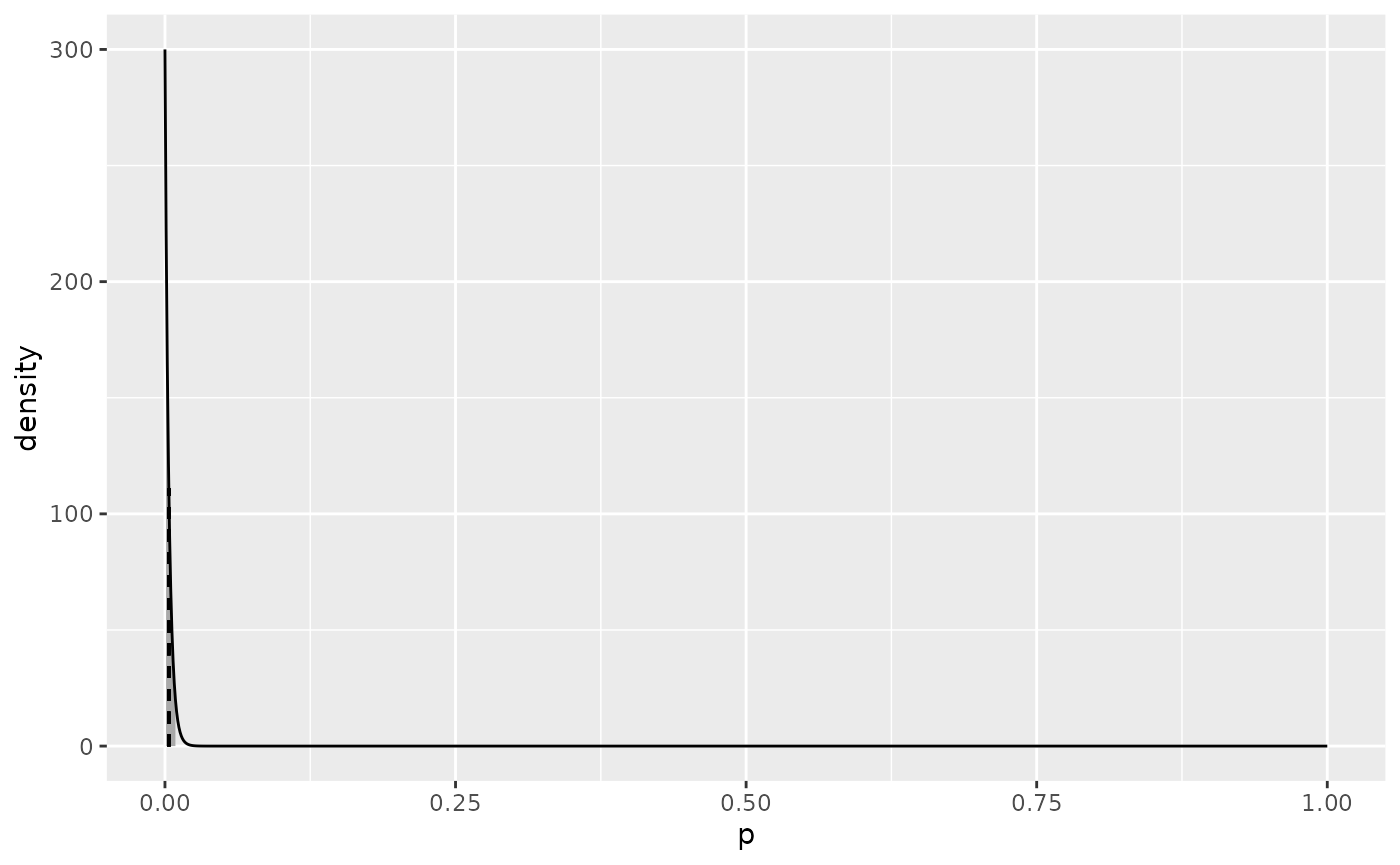
Obviously, most of the probability mass is near zero, but how it’s distributed in that area might be what we really want to know. We can zoom the plot in on that area using the xlim argument to plotdbeta, but for some reason this vignette isn’t building properly when I do that, so here’s how to do it directly with ggplot.
plotdbeta(1, 300) + coord_cartesian(xlim = c(0, 0.02))
#> Coordinate system already present. Adding new coordinate system, which will
#> replace the existing one.